WorkView Cascading Dataset component
The WorkView Cascading Dataset Form Component allows options from multiple chained (i.e. parent-child) WorkView Datasets to be presented to the user to select from, during a form submission. For example, if you wish to capture a location, you may ask for selection from a list of countries, then based on the selected country, ask for selection from regions in that country, followed by a selection from towns/cities in that region. There can be any number of Datasets in the chain, and it is not necessary for every option in a parent dataset to have related options in its child dataset.
Each Dataset in the chain must be used by an Attribute of the selected WorkView Class, in order for it to be used within the form.
Settings
When adding the component to a page template, the following settings will need to be configured:
| Name | Description |
|---|---|
| Application | The WorkView Application in which the Datasets are used |
| Class | The WorkView Class in which the Datasets are used |
| Attribute | The WorkView Attribute which uses the lowest level Dataset (in the example given above, that would be the Dataset listing towns/cities) |
| Top Level DataSet | The Dataset from which the user will be prompted to make their first selection (in the example given above, that would be the Dataset listing countries) |
| Required | Does the question have to be answered? If enabled, the user must select an option at every level for which there are options available |
| Help text | Text displayed under the field to guide the customer as to what they should choose |
| Show internally | If enabled, this question will be shown on internal forms |
| Show publicly | If enabled, this question will be shown on online forms |
For each Dataset in the chain, the following settings are available:
| Name | Description |
|---|---|
| Question text | The label used for the individual dropdown list |
| Include empty option | If enabled, allows you to configure the text for an option which denotes no selection e.g. Please choose... |
| Help text | Text displayed under the individual dropdown list to guide the customer as to what they should choose |
| Set input purpose | Set an input purpose to assist browsers in autofilling the question. See Setting the input purpose of a question for more information on this setting |
Component behavior
The component will display the dropdowns in the order that they should be answered, and hide any that cannot yet be answered (as they rely on a parent value being selected).
Once an answer has been selected at a given level, the relevant options will be loaded for the next dropdown list, which will then be displayed.
If there are no options at the next level dependent on the value selected (or there is an error fetching them), subsequent levels will not be displayed, and the user's response to that question will be considered complete.
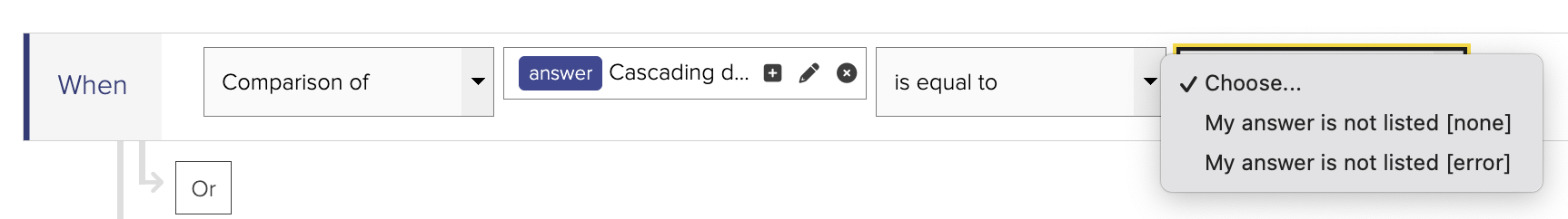
If the top level Dataset contains no values, the component will present a single option to the user: "My answer is not listed" with a value of [none]. If there is an error fetching the values from the top level Dataset, the component will present a single option to the user: "My answer is not listed" with a value of [error].
Return values.
The component will provide a form variable holding the selected answer for each level, the name of this variable is the label given to the dropdown list for that level.
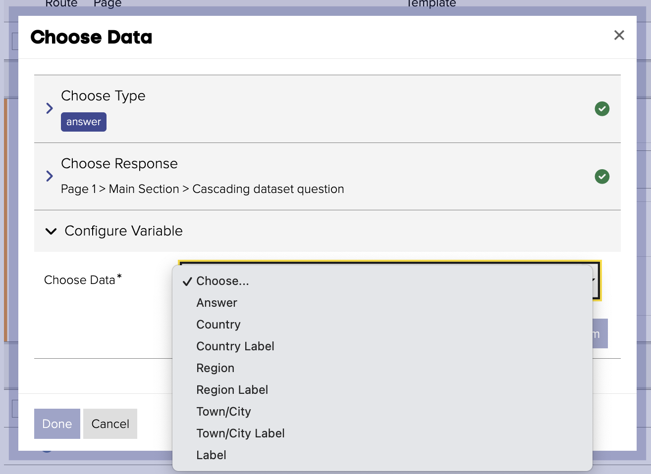
If there are no options available at a given level, the value of the form variable will be [none].
If there is an error fetching options at a given level, the vale of the form variable will be [error].
It is important that you use branching and/or logic to handle these scenarios appropriately.
A "Label" form variable is also provided, which holds a comma separated list of all answers.