Galaxies themes
Editing a theme's design
Each theme has settings to change the theme design, such as the site logo, banner image and banner text.
To edit a theme design:
- Go to Galaxies then Sites
- Click the Design link in the Actions section of the row of the Galaxies site you want to edit.
- The Design items you can change will appear alongside a preview of the Design.
- Use the Save button to save your changes
- Use the Republish button to publish your changes to the live site.
Alternatively, within a Galaxies site, navigate to Settings, Site Settings then Theme Settings.
tip
You can make changes to the theme CSS within the Galaxies site's Control Center. Go to Settings then Stylesheets. Further information about custom stylesheets.
Included themes
A number of themes are provided with Jadu Central.
Alpha
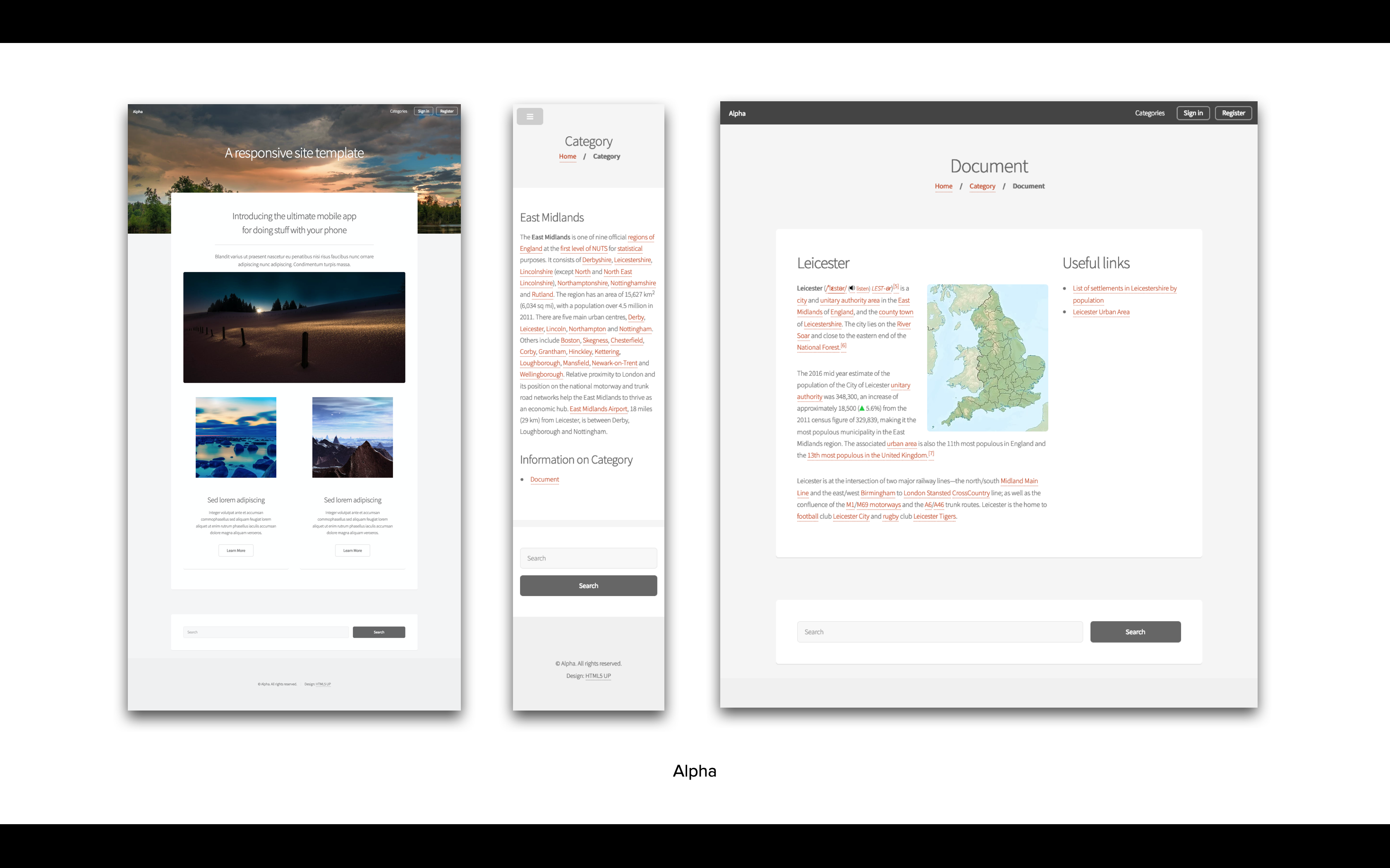
| Theme setting | Notes |
|---|---|
| Site logo | Specify the logo to be used within the theme (minimum recommended size 35px x 35px) |
| Site banner image | The image to be used for the theme's index page banner (minimum recommended size 1920px x 1080px) |
| Site banner text | The text to be displayed on top of your site's index page banner (if left empty defaults to site name) |
Dopetrope
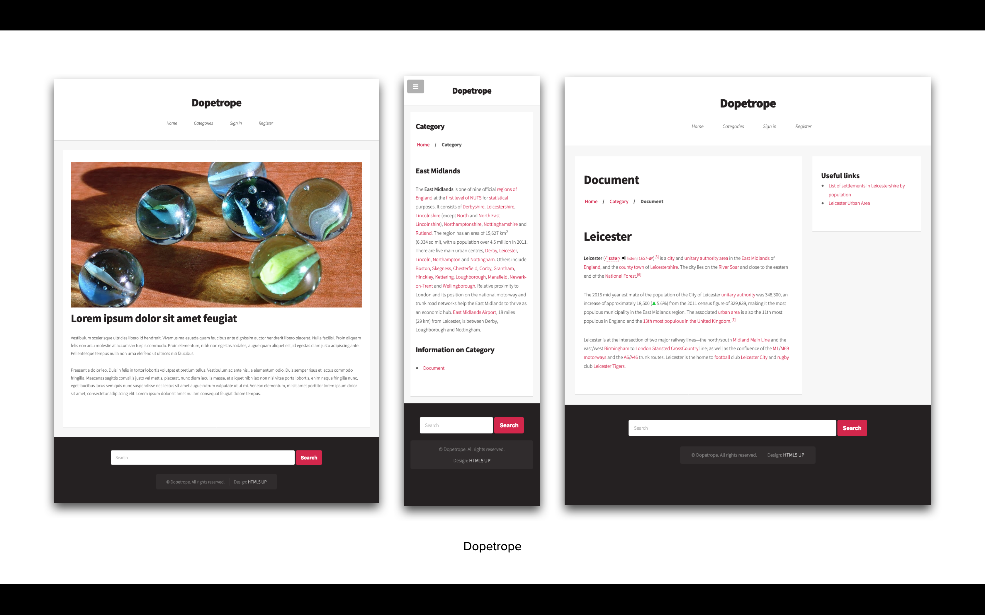
| Theme setting | Notes |
|---|---|
| Site logo | Specify the logo to be used within the theme |
Editorial
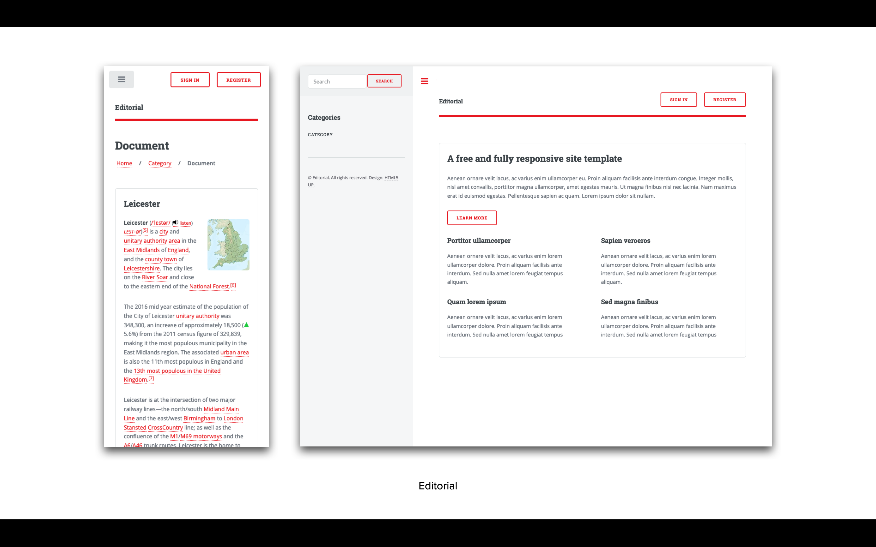
| Theme setting | Notes |
|---|---|
| Site logo | Specify the logo to be used within the theme (minimum recommended size 50px x 50px) |
Origin
Available from Central 4.1.
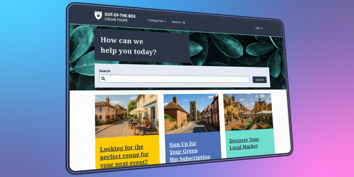
| Theme setting | Description | Notes |
|---|---|---|
| Brand color | HEX value e.g. #2a827f. Can be chosen from the built-in color picker. | Defines the primary colour used for the header, buttons, and social media icons. |
| Accent color | HEX value e.g. #2a827f. Can be chosen from the built-in color picker. | Used for subtle branding elements across the site. Typically appears as a divider between the header and breadcrumb navigation. |
| Override Header Color to White | On/off toggle. | This will use white instead of the brand color. |
| Hide categories dropdown menu | On/off toggle. | Removes the categories menu from the header. |
| Welcome message | Text box | Enter a custom message to replace the default homepage welcome. |
| Show search block on homepage? | On/off toggle. | Enable/disable a search bar at the top of the homepage. If disabled, the Welcome message and Welcome image will also be hidden. |
| Welcome image | Choose an image from the Image library. | Upload an image for the background of the welcome section. Recommended dimensions: 1990px x 812px. |
| Site logo | Choose an image from the Image library. | Used in the header. |
| Site logo (SVG) | Upload a svg file | Alternative site logo. |
| Upload a favicon.ico | Upload an .ico file | 16px x 16px favicon.ico asset to replace the default favicon |
| Apple Touch Favicon asset | Choose an image from the Image library. | Upload a 180px x 180px apple-touch-icon.png asset to replace the default favicon for iOS devices on iOS5 upwards |
| 32px PNG Favicon asset | Choose an image from the Image library. | Upload a 32px x 32px favicon-32x32.png asset to replace the default favicon on Chrome for Mac if .ico is not available |
| 16px PNG Favicon asset | Choose an image from the Image library. | Upload a 16px x 16px favicon-16x16.png asset to replace the default favicon on Chrome for Windows |
| Full path to SVG Favicon asset | Upload an .svg file. | An oversized safari-pinned-tab.svg asset (size is irrelevant) to replace the default favicon. |
| Open Graph Image | Choose an image from the Image library. | For optimal Open Graph images aim for a size of 1200 x 630 pixels. |
| Header Nav | Text box | Which navigation widget to use for additional header navigation, provide position. Leave blank if not needed. If your header navigation widget is in position 1, enter "1" to enable it. |
| Footer Nav | Text box | Which navigation widget to use for additional footer navigation, provide position. Leave blank if not needed. If your footer navigation widget is in position 1, enter "1" to enable it. |
| Hide the Sign In link | On/off toggle | Toggle the sign-in option on or off for customers from the header. |
| Redirect to referer after homepage login | On/off toggle | Determines where the user is redirected to after sign in - when disabled, redirect to the account page; otherwise return to the referrer. |
| Disable masonry layout for news and event pages | On/off toggle | Grid-based layout or row-based content. |
| Disable tile navigation for categories and widgets | On/off toggle | Option of tiles or links. |
| Facebook URL | Text box | This will show a clickable icon in the footer. If left blank, the icon will not be displayed |
| X (formerly Twitter) URL | Text box | This will show a clickable icon in the footer. If left blank, the icon will not be displayed. |
| Instagram URL | Text box | This will show a clickable icon in the footer. If left blank, the icon will not be displayed. |
| LinkedIn URL | Text box | This will show a clickable icon in the footer. If left blank, the icon will not be displayed. |
| YouTube URL | Text box | This will show a clickable icon in the footer. If left blank, the icon will not be displayed. |
| Bluesky URL | Text box | This will show a clickable icon in the footer. If left blank, the icon will not be displayed. |
| Override CSS | Text area | Enter custom CSS to modify the theme’s default styling (e.g., fonts, button styles). |
| Override header HTML | Text area | This will replace the existing header HTML. Use this feature for advanced modifications, such as embedding widgets, third-party integrations, or additional branding elements. |
| Override footer HTML | Text area | This will replace the existing footer HTML. Use this feature for advanced modifications, such as embedding widgets, third-party integrations, or additional branding elements. |
Phantom
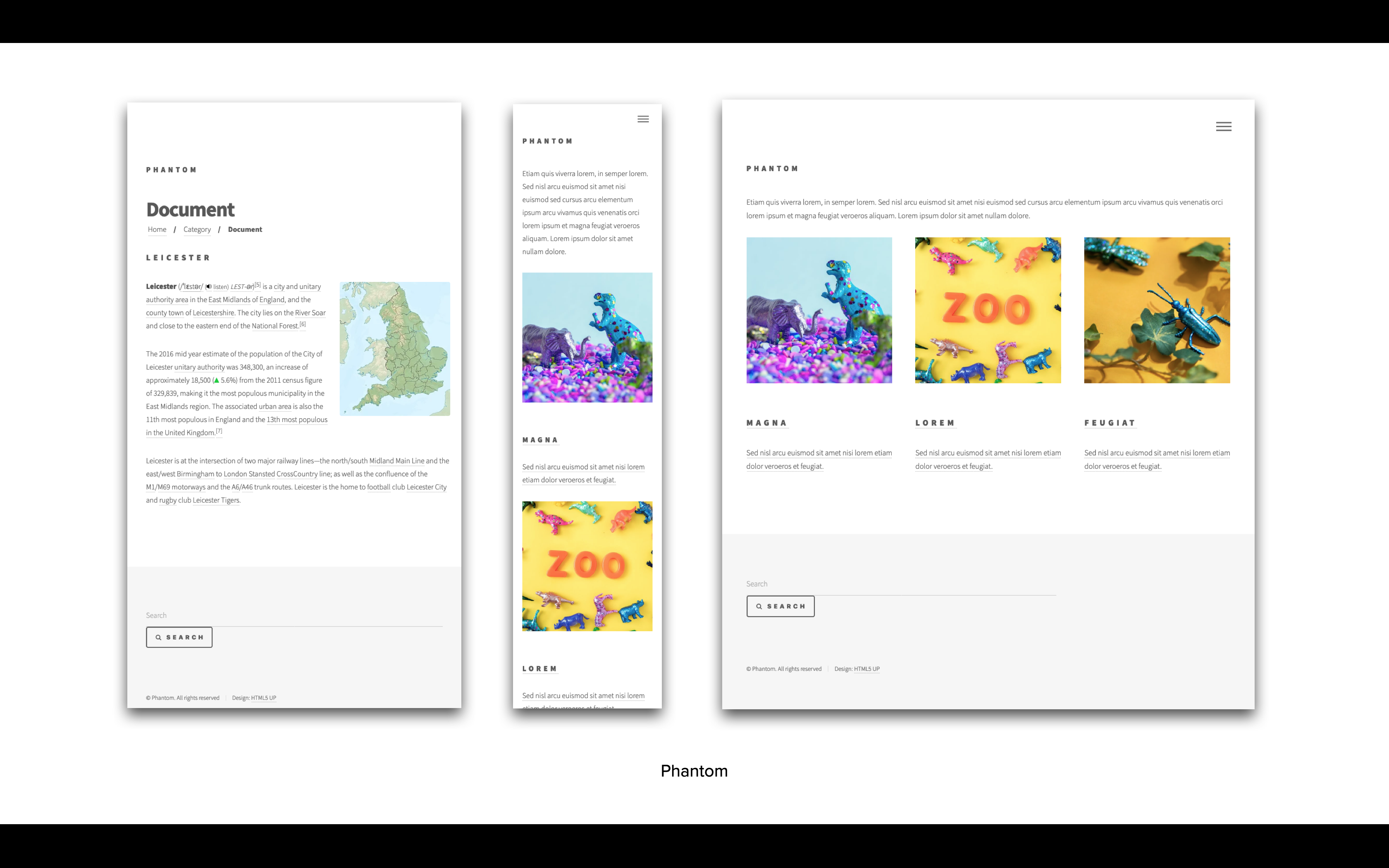
| Theme setting | Notes |
|---|---|
| Site logo | Specify the logo to be used within the theme (minimum recommended size 37px x 37px) |
| Show site name | Toggle the visibility of the Galaxy site name |
| Accent colour | Customise the theme's accent colour (a hexidemical colour value e.g: #f2849e) |
Spectral
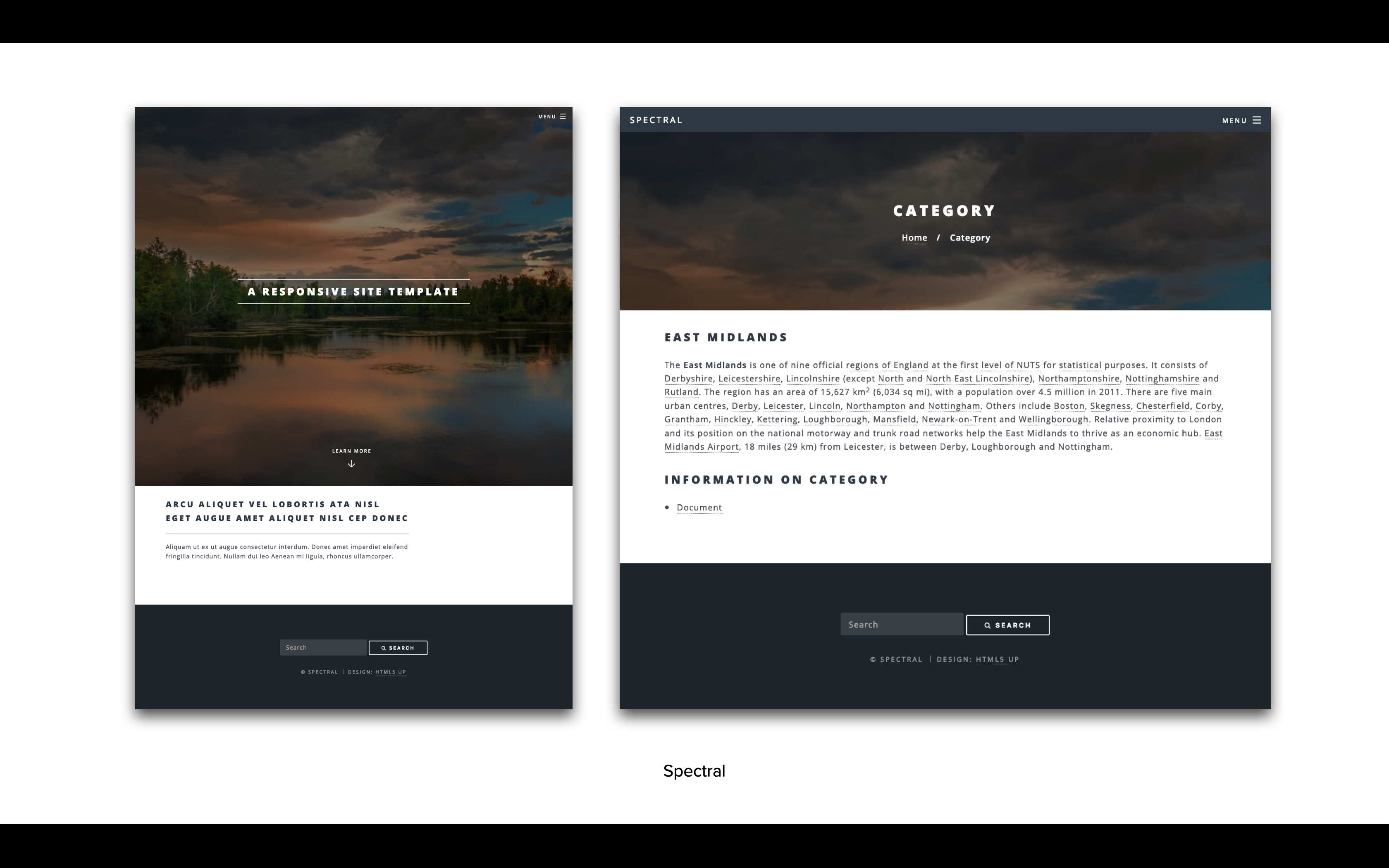
| Theme setting | Notes |
|---|---|
| Site logo | Specify the logo to be used within the theme (minimum recommended size 35px x 35px) |
| Site banner image | Specify the image to be used for the theme's page banner (minimum recommended size 1920px x 1080px) |
| Site banner text | The text to be displayed on top of your site's index page banner (if left empty defaults to site name) |
GOV.UK-Frontend
A theme is available based upon the GOV.UK design system. It brings together the latest research, design and development from across UK government.